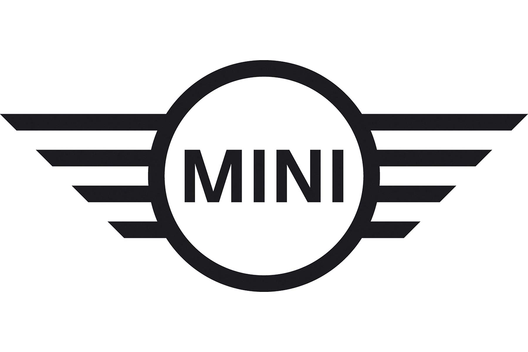
Modern Mini is to become a bit more modern-looking from March 2018, with the roll-out of a “future-oriented” logo across the range that reinterprets the brand’s badge in a contemporary flat design style.
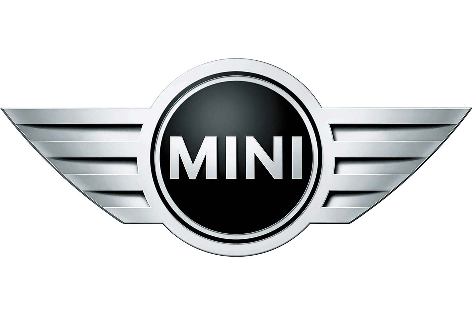
The current logo has been used since 2001, and is a stylised 3D interpretation of the classic British Rover Group (RIP) badge used on retro Minis since 1996. The BMW Group-owned firm has now decided to ‘reduce it down to the essentials’.
Key graphic elements are preserved, say the firm’s graphic design whizzes: “The preservation of the fundamental, tradition-steeped motif of a winged wheel with the brand name printed in capital letters at the centre ensures the logo will be instantly recognzed”.

But the shading and grey tones of the old logo have been removed, and it’s now fully depicted in black and white. This, apparently, “conveys the authenticity and clarity”, and the fact it’s now a 2D logo rather than 3D ensures it can be used more universally. This is great news for the firm’s branding division, which will be able to use the Mini tag more liberally in many more applications, including digitally.
Mini’s going to fit it to all new models from 2018, on the bonnet and bootlid, the centre of the steering wheel and the remote control keyfob.
The new logo was first seen back in 2015 at the Frankfurt Motor Show. That it’s taken this long to reach production cars shows the complexities involved in producing cars. Even redesigning the remote keyfob alone, and rolling it out across the range in high volume, is anything but straightforward…

