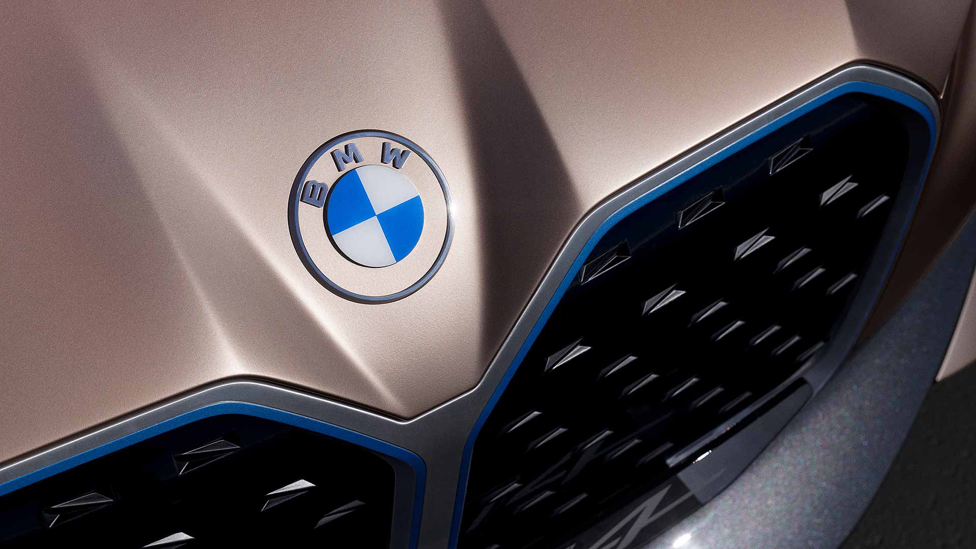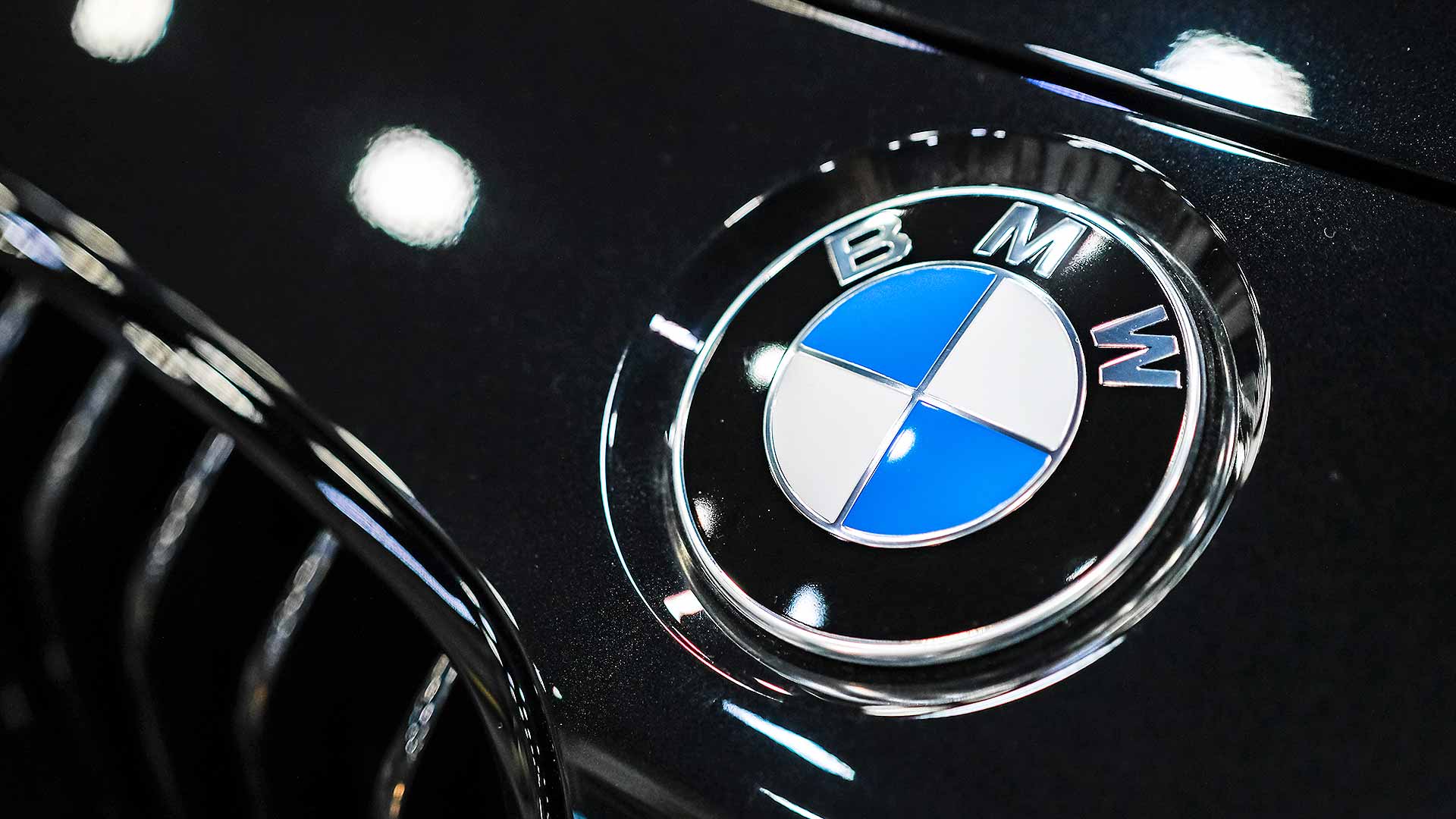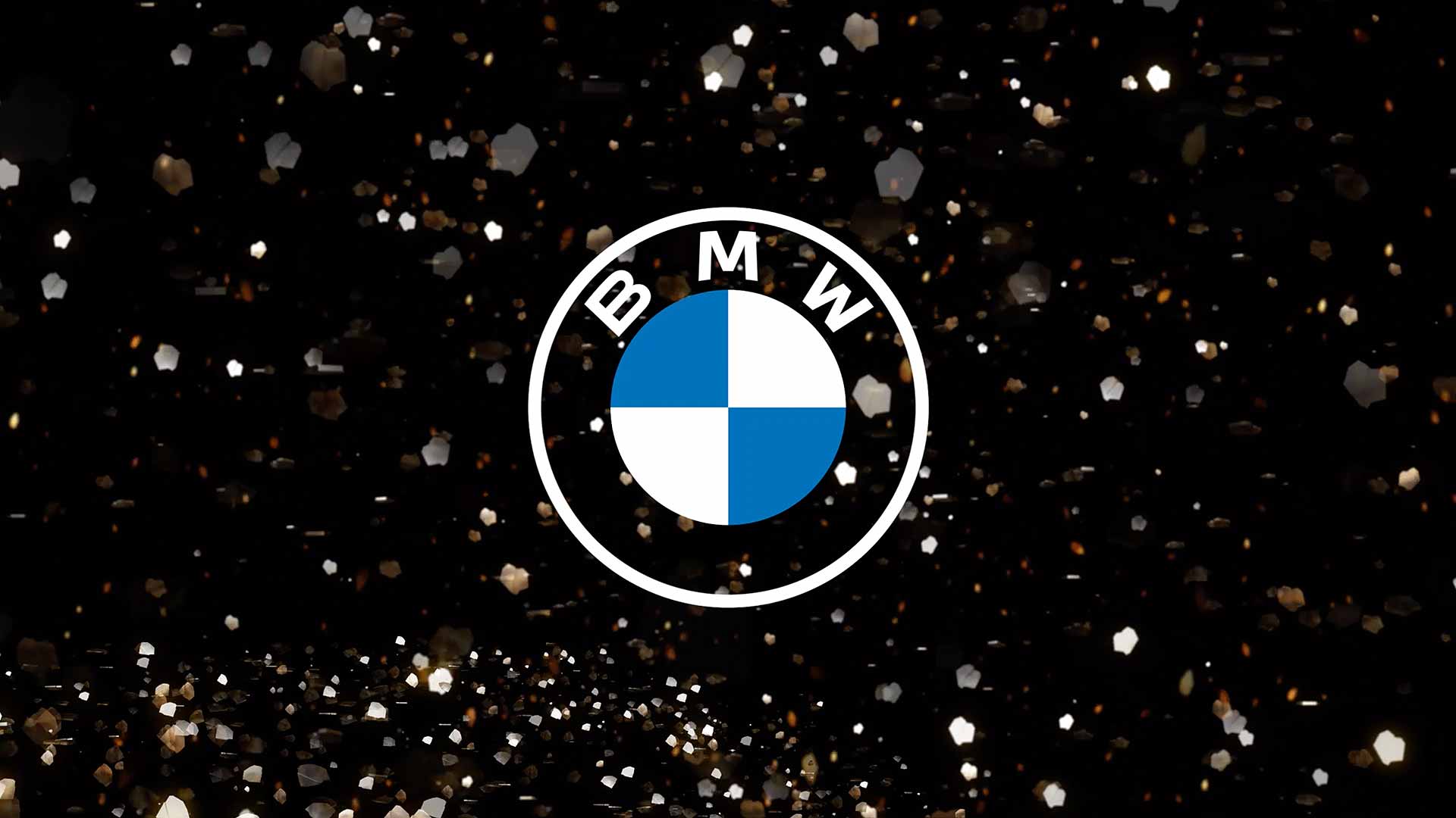
BMW has unveiled a new logo that follows the trend for ‘flat’ 2D designs – but it is NOT going to replace the current roundel on its cars.
A BMW spokesman confirmed to Motoring Research that the redesigned logo is intended only for use in communications.
ALSO SEE: Spot the difference: test your knowledge of car badges
“It won’t be deployed physically on cars… the existing logo remains in use there.”

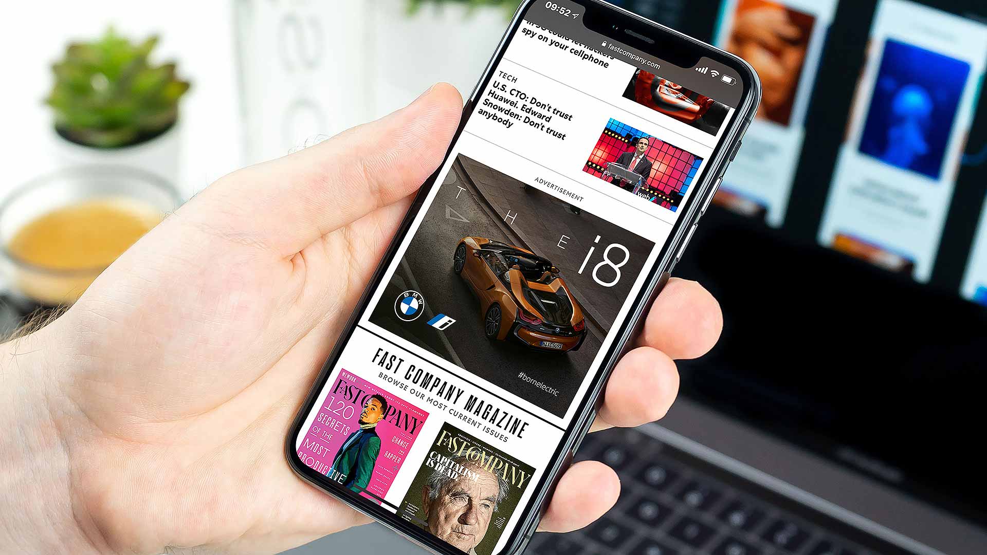
BMW’s new logo is intended for media branding and will be used in addition to the existing classic logo.

The new design is described as better suited to the digital age: it is “pared-down… [which] conveys openness and clarity”.
It is more transparent, deleting the black ring surrounding the ‘BMW’ lettering, which the company says future-proofs its online and offline identity.

“With visual restraint and graphic flexibility, we are equipping ourselves for the vast variety of touchpoints in communication at which BMW will be present,” said senior vice president Jens Thiemer.
The transition to the new logo will take place between now and the end of May 2021. All online and offline communications will switch to it, including at trade fairs, motorshows and events.
Last year, Volkswagen revealed its redesigned logo, which is also a 2D ‘flat’ design. The brand said it helped make digital communications more consistent.
In 2018, Mini also updated its logo with a two-dimensional design.
[…] As stated by Thiemer, this renewed simplicity will serve them well in applying the new logo across multiple online touchpoints. While it can already be viewed on their website and social media, whether it will be featured on future car models is yet to be seen – at this stage, BMW has stated that they intend to use it only for branding and corporate communications. […]